面试官:你可以用纯 CSS 判断鼠标进入的方向吗?
陈大鱼头 ... 2021-8-3 About 4 min
- 作者:陈大鱼头
- github: KRISACHAN (opens new window)
# 前言
在之前某一个前端技术群里,有一个群友说他面试的时候遇到了一个问题,就是面试官让他用纯 CSS 来实现一个根据鼠标移动位置觉得物体移动方向的 DEMO。
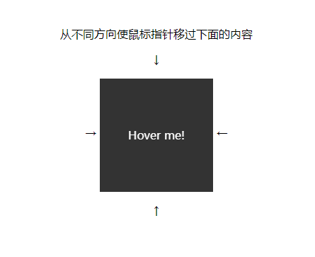
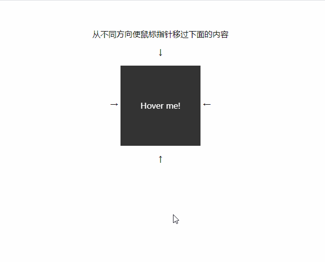
给出的初始结构如下:
<style>
body {
    padding: 2em;
    text-align: center;
}
.block {
    position: relative;
    display: inline-block;
    width: 10em;
    height: 10em;
    vertical-align: middle;
}

.block_content {
    position: absolute;
    top: 0;
    left: 0;
    width: 100%;
    height: 100%;
    text-align: center;
    line-height: 10em;
    background: #333;
    color: #FFF;
}
</style>
<p class="text">从不同方向使鼠标指针移过下面的内容</p>
<p>↓</p>
<span>→ </span>
<div class="block">
    <div class="block_content">
        Hover me!
    </div>
</div>
<span> ←</span>
<p>↑</p>
1
2
3
4
5
6
7
8
9
10
11
12
13
14
15
16
17
18
19
20
21
22
23
24
25
26
27
28
29
30
31
32
33
34
35
2
3
4
5
6
7
8
9
10
11
12
13
14
15
16
17
18
19
20
21
22
23
24
25
26
27
28
29
30
31
32
33
34
35
效果图如下:
# 实现
净会问这种不实用又跟业务没啥关系的问题,气抖冷,中国前端什么时候才能真正的站起来。
谢谢面试官提出的好问题,我会努力实现出来的。
所以这个功能真的能用纯 CSS 实现吗?
答案是可以的,首先我们来分解下思路。
# CSS 鼠标事件
首先根据题干,我们知道这题是需要用到鼠标操作的,JS 里我们有各种mouse事件,但同样的,CSS 我们也有:hover。
这题我们需要利用到的选择器就是:hover了
# 判断方向
判断方向 的功能便是本题的核心。
从题图上来看,其实已经给了我们方向的指引,就是告诉我们鼠标要通过四个箭头的方向进入。
然后就是如果要纯 CSS 来实现,就是我们的鼠标必须要触碰到某个关键节点,而且这个节点的某个表现一定是可以代表这个方位的。
这就是题目给出的两个隐藏条件。
所以我们来尝试下实现。
首先要通过:hover来触碰到这个关键节点,而且是要在箭头指向的方向下触碰触发,那么我们可以在箭头所指的方向都加上一个能被触碰到的物体,例如这样:
<style>
.block_hoverer {
    position: absolute;
    width: 100%;
    height: 100%;
    z-index: 1;
}
.block_hoverer:nth-child(1) {
    background: red;
}

.block_hoverer:nth-child(2) {
    background: lime;
}

.block_hoverer:nth-child(3) {
    background: orange;
}

.block_hoverer:nth-child(4) {
    background: blue;
}
</style>
<div class="block">
    <div class="block_hoverer">上</div>
    <div class="block_hoverer">下</div>
    <div class="block_hoverer">左</div>
    <div class="block_hoverer">右</div>
    <div class="block_content">
        Hover me!
    </div>
</div>
1
2
3
4
5
6
7
8
9
10
11
12
13
14
15
16
17
18
19
20
21
22
23
24
25
26
27
28
29
30
31
32
2
3
4
5
6
7
8
9
10
11
12
13
14
15
16
17
18
19
20
21
22
23
24
25
26
27
28
29
30
31
32
效果如下:
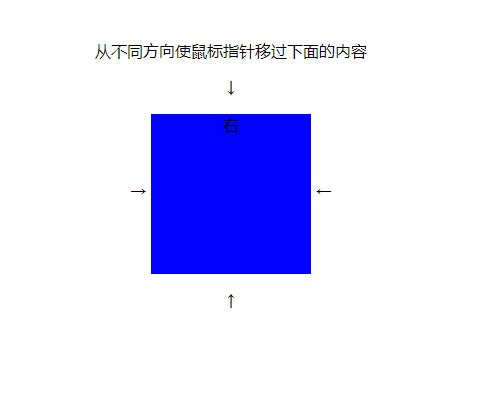
我们可以发现,除了 右块 之外,都被遮住了,嗯,正常现象。
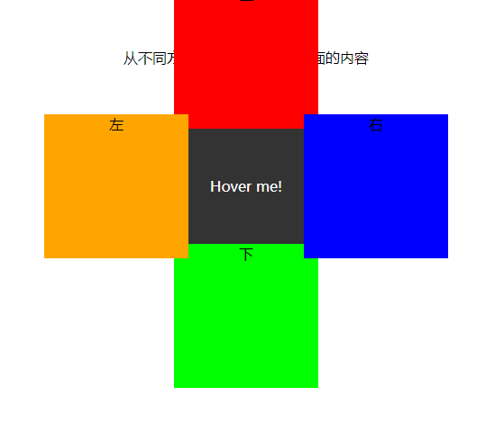
接下来我们只需要让这几个块退到边缘即可。
代码如下:
.block_hoverer {
  position: absolute;
  z-index: 1;
  width: 100%;
  height: 100%;
  transition: all 0.3s ease;
}
.block_hoverer:nth-child(1) {
  background: red;
  top: -90%;
}

.block_hoverer:nth-child(2) {
  background: lime;
  top: 90%;
}

.block_hoverer:nth-child(3) {
  background: orange;
  left: -90%;
}

.block_hoverer:nth-child(4) {
  background: blue;
  left: 90%;
}
1
2
3
4
5
6
7
8
9
10
11
12
13
14
15
16
17
18
19
20
21
22
23
24
25
26
2
3
4
5
6
7
8
9
10
11
12
13
14
15
16
17
18
19
20
21
22
23
24
25
26
效果如下:
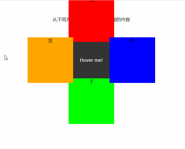
然后我们加上过渡:
.block_hoverer {
  transition: all 0.3s ease;
}
.block_hoverer:hover {
  opacity: 1;
  top: 0;
  left: 0;
}
1
2
3
4
5
6
7
8
2
3
4
5
6
7
8
效果如下:
一步就是隐藏起来:
.block {
  position: relative;
  display: inline-block;
  overflow: hidden;
  width: 10em;
  height: 10em;
  vertical-align: middle;
}
.block_hoverer {
  opacity: 0;
}
.block_hoverer:hover {
  opacity: 1;
}
1
2
3
4
5
6
7
8
9
10
11
12
13
14
2
3
4
5
6
7
8
9
10
11
12
13
14
效果如下:
所以我们有完整代码如下:
<style>
    body {
        padding: 2em;
        text-align: center;
    }
    .block {
        position: relative;
        display: inline-block;
        overflow:hidden;
        width: 10em;
        height: 10em;
        vertical-align: middle;
        transform: translateZ(0);
    }
    .block_hoverer {
        position: absolute;
        z-index: 1;
        width: 100%;
        height: 100%;
        opacity: 0;
        transition: all .3s ease;
    }

    .block_hoverer:nth-child(1) {
        background: red;
        top: -90%;
    }

    .block_hoverer:nth-child(2) {
        background: lime;
        top: 90%;
    }

    .block_hoverer:nth-child(3) {
        background: orange;
        left: -90%;
    }

    .block_hoverer:nth-child(4) {
        background: blue;
        left: 90%;
    }
    .block_hoverer:hover {
        opacity: 1;
        top: 0;
        left: 0;
    }

    .block_content {
        position: absolute;
        top: 0;
        left: 0;
        width: 100%;
        height: 100%;
        text-align: center;
        line-height: 10em;
        background: #333;
        color: #FFF;
    }
</style>
<body>
    <p class="text">从不同方向使鼠标指针移过下面的内容</p>
    <p>↓</p>
    <span>→ </span>
    <div class="block">
        <div class="block_hoverer">1</div>
        <div class="block_hoverer">2</div>
        <div class="block_hoverer">3</div>
        <div class="block_hoverer">4</div>
        <div class="block_content">
            Hover me!
        </div>
    </div>
    <span> ←</span>
    <p>↑</p>
</body>
1
2
3
4
5
6
7
8
9
10
11
12
13
14
15
16
17
18
19
20
21
22
23
24
25
26
27
28
29
30
31
32
33
34
35
36
37
38
39
40
41
42
43
44
45
46
47
48
49
50
51
52
53
54
55
56
57
58
59
60
61
62
63
64
65
66
67
68
69
70
71
72
73
74
75
76
2
3
4
5
6
7
8
9
10
11
12
13
14
15
16
17
18
19
20
21
22
23
24
25
26
27
28
29
30
31
32
33
34
35
36
37
38
39
40
41
42
43
44
45
46
47
48
49
50
51
52
53
54
55
56
57
58
59
60
61
62
63
64
65
66
67
68
69
70
71
72
73
74
75
76
完整效果可以查看鱼头的codepen (opens new window)
虽然没什么软用,但是应付面试官应该是够用了。
感谢面试官提出的问题,让我实现了这个功能,对 CSS 有了更深的理解。
# 后记
如果你喜欢探讨技术,或者对本文有任何的意见或建议,非常欢迎加鱼头微信好友一起探讨,当然,鱼头也非常希望能跟你一起聊生活,聊爱好,谈天说地。
鱼头的微信号是:krisChans95
也可以扫码关注公众号,订阅更多精彩内容。