深藏在CSS里的诗情画意
陈大鱼头 ... 2021-8-3 About 17 min
- 作者:陈大鱼头
- github: KRISACHAN (opens new window)
一声梧叶一声秋,一点芭蕉一点愁,三更归梦三更后。
大概是因为入秋的缘故,最近的感慨比较多。
很多的碎碎念都用都用 HTML 跟 CSS 来记录在我的codepen https://codepen.io/krischan77 (opens new window) 至上,眼见积累到了一些了,就选出几个来与大家一同分享。
(免责声明:有些效果是我在网上看到觉得好,然后临摹下来的,创意不是原创,但是代码是自己手写的,如果有看到类似的效果,欢迎大家用来作对比。)
# 洋溢着青春的活力

这是两个带有弹性势能的弹跳盒,实现的主要思路就是利用 @keyframes 来控制 盒子的 scale 跟 translate ,从而在视觉上达成弹跳的效果。
效果地址:https://codepen.io/krischan77/pen/QXLdzP (opens new window)
具体代码:
<style>
    html,
    body,
    div {
        margin: 0;
        padding: 0;
    }
    html,
    body {
        width: 100%;
        height: 100%;
    }
    .盒子组 {
        width: 200px;
        height: 200px;
        position: absolute;
        left: 50%;
        top: 30px;
        transform: translateX(-50%);
    }
    .大盒子 {
        width: 100px;
        height: 100px;
        transform: scale(1, 1) translate(0, 0px);
        animation: 大盒子跳 1s 0.3s linear infinite;
        background: #3170a7;
        margin: 100px auto;
    }
    .小盒子 {
        width: 60px;
        height: 60px;
        transform: scale(1, 1) translate(0, 0px);
        animation: 小盒子跳 1s 0.3s linear infinite;
        background: #40a070;
        margin: 0 auto;
        position: relative;
        top: -60px;
    }
    @keyframes 大盒子跳 {
        0% {
            transform: scale(1, 1) translate(0, 0px);
        }
        15% {
            transform: scale(1.13, 0.87) translate(0, 0px);
        }
        30% {
            transform: scale(0.92, 1.08) translate(0, -40px);
        }
        45% {
            transform: scale(1.05, 0.95) translate(0, 0px);
        }
        60% {
            transform: scale(0.93, 1.02) translate(0, -20px);
        }
        75% {
            transform: scale(1, 1) translate(0, 0px);
        }
        100% {
            transform: scale(1, 1) translate(0, 0px);
        }
    }
    @keyframes 小盒子跳 {
        0% {
            transform: scale(1, 1) translate(0, 0px);
        }
        50% {
            transform: scale(1, 1) translate(0, 0px);
        }
        60% {
            transform: scale(1.13, 0.87) translate(0, 0px);
        }
        70% {
            transform: scale(0.92, 1.08) translate(0, -40px);
        }
        80% {
            transform: scale(1.05, 0.95) translate(0, 0px);
        }
        90% {
            transform: scale(0.98, 1.02) translate(0, -20px);
        }
        100% {
            transform: scale(1, 1) translate(0, 0px);
        }
    }
</style>
<div class="盒子组">
	<div class="大盒子">
		<div class="小盒子"></div>
	</div>
</div>
1
2
3
4
5
6
7
8
9
10
11
12
13
14
15
16
17
18
19
20
21
22
23
24
25
26
27
28
29
30
31
32
33
34
35
36
37
38
39
40
41
42
43
44
45
46
47
48
49
50
51
52
53
54
55
56
57
58
59
60
61
62
63
64
65
66
67
68
69
70
71
72
73
74
75
76
77
78
79
80
81
82
83
84
85
86
87
88
89
90
2
3
4
5
6
7
8
9
10
11
12
13
14
15
16
17
18
19
20
21
22
23
24
25
26
27
28
29
30
31
32
33
34
35
36
37
38
39
40
41
42
43
44
45
46
47
48
49
50
51
52
53
54
55
56
57
58
59
60
61
62
63
64
65
66
67
68
69
70
71
72
73
74
75
76
77
78
79
80
81
82
83
84
85
86
87
88
89
90
# 你的手指在哪里
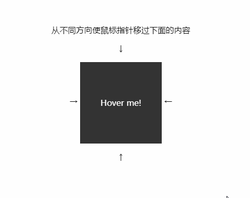
这是在很久之前一个网友面试时被问到的问题,当时题目是如何用纯CSS实现物体根据鼠标进入盒子的方向移动,一道挺有意思的题目,当时在群里各位大佬的讨论下,就有了这样的实现。
实现思路主要是在盒子四个不同的方位定位好子盒子,然后隐藏的同时让它们稍稍进入父盒子里一点,那么再鼠标划进去时,就能触发该方位隐藏的子盒子的 hover 事件,利用这个障眼法从而达到题目的效果。
效果地址:https://codepen.io/krischan77/pen/RzomRX (opens new window)
代码如下:
<style>
    body {
        padding: 2em;
        text-align: center;
    }
    .block {
        position: relative;
        display: inline-block;
        overflow:hidden;
        width: 10em;
        height: 10em;
        vertical-align: middle;
        -webkit-transform: translateZ(0);
    }
    .block_hoverer {
        position: absolute;
        z-index: 1;
        width: 100%;
        height: 100%;
            opacity: 0;
            transition: all .3s ease;
    }

    .block_hoverer:nth-child(1) {
            background: red;
            top:-90%;

    }

    .block_hoverer:nth-child(2) {
            background: lime;
            top:90%;

    }

    .block_hoverer:nth-child(3) {
            background: orange;
            left:-90%;

    }

    .block_hoverer:nth-child(4) {
            background: blue;
            left:90%;

    }
    .block_hoverer:hover {
            opacity:1;
            top:0;
            left:0;
    }

    .block_content {
        position: absolute;
        top: 0;
        left: 0;
        width: 100%;
        height: 100%;
        text-align: center;
        line-height: 10em;
        background: #333;
        color: #FFF;
    }
</style>
<p class="text">从不同方向使鼠标指针移过下面的内容</p>
<p>↓</p>
<span>→ </span>
<div class="block">
	<div class="block_hoverer">1</div>
	<div class="block_hoverer">2</div>
	<div class="block_hoverer">3</div>
	<div class="block_hoverer">4</div>
	<div class="block_content">
		Hover me!
	</div>
</div>
<span> ←</span>
<p>↑</p>
1
2
3
4
5
6
7
8
9
10
11
12
13
14
15
16
17
18
19
20
21
22
23
24
25
26
27
28
29
30
31
32
33
34
35
36
37
38
39
40
41
42
43
44
45
46
47
48
49
50
51
52
53
54
55
56
57
58
59
60
61
62
63
64
65
66
67
68
69
70
71
72
73
74
75
76
77
78
79
2
3
4
5
6
7
8
9
10
11
12
13
14
15
16
17
18
19
20
21
22
23
24
25
26
27
28
29
30
31
32
33
34
35
36
37
38
39
40
41
42
43
44
45
46
47
48
49
50
51
52
53
54
55
56
57
58
59
60
61
62
63
64
65
66
67
68
69
70
71
72
73
74
75
76
77
78
79
# 摘下星星送给你

这是用纯CSS实现的一个评级功能,主要是利用了 label 标签跟 input 标签的联动性,以及 伪类:hover 跟 :focus 的操作性实现的。
效果地址:https://codepen.io/krischan77/pen/NZevBr (opens new window)
代码如下:
<style>
      html,
      body,
      div {
        margin: 0;
        padding: 0;
      }
      html,
      body {
        width: 100%;
        height: 100%;
      }
      .container1,
      .container2
       {
        font-size: 60px;
        display: flex;
        flex-direction: row-reverse;
        justify-content: center;
      }
      .container1 input {
        opacity: 0;
        position: absolute;
      }
      .container1 label {
        color: #aaa;
        text-decoration: none;
        -webkit-transition: color .4s;
        -moz-transition: color .4s;
        -o-transition: color .4s;
        transition: color .4s;
      }
      .container1 label:hover ~ label,
      .container1 input:focus ~ label,
      .container1 label:hover {
        color: #cc163a;
        cursor: pointer;
      }


      .container2 label {
        cursor: pointer;
        font-size: 60px;
      }
      .container2 input {
        opacity: 0;
        position: absolute;
      }
      .container2 label:hover ~ label,
      .container2 label:hover,
      .container2 input:focus ~ label,
      .container2 input:checked ~ label {
        color: #cc163a;
      }
</style>
<section class="container1">
    <input name="star1" id="s1" type="radio" /><label for="s1">☆</label>
    <input name="star1" id="s2" type="radio" /><label for="s2">☆</label>
    <input name="star1" id="s3" type="radio" /><label for="s3">☆</label>
    <input name="star1" id="s4" type="radio" /><label for="s4">☆</label>
    <input name="star1" id="s5" type="radio" /><label for="s5">☆</label>
</section>
<section class="container2">
    <input type="radio" name="star2" id="s6">
    <label for="s6">☆</label>
    <input type="radio" name="star2" id="s7">
    <label for="s7">☆</label>
    <input type="radio" name="star2" id="s8">
    <label for="s8">☆</label>
    <input type="radio" name="star2" id="s9">
    <label for="s9">☆</label>
    <input type="radio" name="star2" id="s10">
    <label for="s10">☆</label>
</section>
1
2
3
4
5
6
7
8
9
10
11
12
13
14
15
16
17
18
19
20
21
22
23
24
25
26
27
28
29
30
31
32
33
34
35
36
37
38
39
40
41
42
43
44
45
46
47
48
49
50
51
52
53
54
55
56
57
58
59
60
61
62
63
64
65
66
67
68
69
70
71
72
73
74
2
3
4
5
6
7
8
9
10
11
12
13
14
15
16
17
18
19
20
21
22
23
24
25
26
27
28
29
30
31
32
33
34
35
36
37
38
39
40
41
42
43
44
45
46
47
48
49
50
51
52
53
54
55
56
57
58
59
60
61
62
63
64
65
66
67
68
69
70
71
72
73
74
# 客官今天要来点兔子吗?

这是一只兔子的路径动画,实现原理就是利用 animation 来操作 SVG path的 stroke-dashoffset ,从而实现路径动画。
效果地址:https://codepen.io/krischan77/pen/mdbQqRm (opens new window)
代码如下:
<style>
    path {
        stroke-dasharray: 6600;
        stroke-dashoffset: 6600;
        animation: dash 4s linear alternate infinite;
        fill: transparent;
    }
    @keyframes dash {
        to {
            stroke-dashoffset: 0;
            fill: #d81e06;
        }
    }
</style>
<svg width="240" height="240" viewBox="0 0 1165 1024" version="1.1">
	<path fill="transparent" stroke="#1296db" stroke-width="30" d="M0.000556 865.83469a66.118285 66.118285 0 0 0 65.93308 65.93308 69.08157 69.08157 0 0 0 39.63393-12.593959 222.246337 222.246337 0 0 0 111.123169 49.44981l26.113945 4.444927a232.247423 232.247423 0 0 0-5.370953 47.968168v2.222463h383.189726v-31.299693a123.717128 123.717128 0 0 0-62.043769-50.746247h-98.158799l-21.669018-15.927654 200.762525-50.931452 11.297522 17.594501 30.373666 79.823477 17.224092 52.227889H907.506434v-32.596129a144.83053 144.83053 0 0 0-38.893109-27.780793l-24.076687-11.667932-40.745161-62.969796v-112.790016a1069.375294 1069.375294 0 0 0 126.495207-140.015193l8.334237-0.926026 188.724182-49.635016h0.926026l36.11503-55.561584v-34.448182l-88.528124-97.417978a257.620546 257.620546 0 0 0-84.824019-61.117743l-13.519986-49.820221L944.54749 157.980105l-29.632845-67.414722L825.460495 10.556701A45.745704 45.745704 0 0 0 777.862737 3.889311a44.819678 44.819678 0 0 0-17.409296 13.33478l-7.408211-6.66739a46.30132 46.30132 0 0 0-74.082113 43.708446l60.376922 190.76144 72.785675 64.821849 12.96437 34.448182a371.706999 371.706999 0 0 0-58.710074 68.711159l-7.778622 11.482728-560.245976 107.048652a222.246337 222.246337 0 0 0-166.684753 267.066016c0 3.14849 1.666848 6.29698 2.592874 9.445469A65.377464 65.377464 0 0 0 0.000556 865.83469z" class="path"></path>
</svg>
1
2
3
4
5
6
7
8
9
10
11
12
13
14
15
16
17
2
3
4
5
6
7
8
9
10
11
12
13
14
15
16
17
# 滴水,亦能穿石

这个动效主要是利用了animation 来控制不同关键帧下的水滴状态,这里的滴水动画要注意的就是水滴下落的形变,以及到地上时引起的涟漪,主要是要尽量贴合物理现象。
效果地址:https://codepen.io/krischan77/pen/pXdBWP (opens new window)
代码如下:
<style>
    .water-damage {
        position: absolute;
        top: 50%;
        left: 50%;
        transform: translate(-50%, -50%);
        width: 200px;
        height: 200px;
        perspective: 600px;
        transform-style: preserve-3d;
    }
    .water-drop {
        position: absolute;
        top: 50%;
        left: 50%;
        transform: translate(-50%, -50%);
        z-index: 10;
        width: 0;
        height: 0;
        border: 10px solid #30DFF3;
        border-radius: 1000px;
        margin-top: -10px;
        margin-left: -10px;
        opacity: 0;
        transform-style: preserve-3d;
        transform-origin: 50% 50%;
        transform: translate(0, -100px) scale(1, 1);
        animation: water-drop 3000ms cubic-bezier(.56, .18, .92, .69) infinite;
    }
    .water-drop::after {
        content: "";
        width: 0;
        height: 0;
        border-style: solid;
        border-width: 0 7.5px 13.0px 7.5px;
        border-color: transparent transparent #30DFF3 transparent;
        position: absolute;
        left: 50%;
        top: -20px;
        transform: translate(-50%, 0);
    }
    @keyframes water-drop {
        0% {
            opacity: 0;
            z-index: 10;
            transform: translate(0, -100px) scale(1, 1);
        }
        50% {
            opacity: 1;
            z-index: 10;
            transform: translate(0, 0) scale(0.8, 1.2);
        }
        51% {
            opacity: 1;
            z-index: 10;
            margin-top: -10px;
            margin-left: -10px;
            border-width: 10px;
            transform: rotateX(70deg);
            animation-timing-function: cubic-bezier(.12, .41, .63, .99);
        }
        100% {
            opacity: 0;
            z-index: 1;
            margin-top: -200px;
            margin-left: -200px;
            border-width: 200px;
            transform: rotateX(70deg);
            animation-timing-function: cubic-bezier(.12, .41, .63, .99);
        }
    }
</style>
<div class="water-damage">
	<div class="water-drop"></div>
</div>
1
2
3
4
5
6
7
8
9
10
11
12
13
14
15
16
17
18
19
20
21
22
23
24
25
26
27
28
29
30
31
32
33
34
35
36
37
38
39
40
41
42
43
44
45
46
47
48
49
50
51
52
53
54
55
56
57
58
59
60
61
62
63
64
65
66
67
68
69
70
71
72
73
74
75
2
3
4
5
6
7
8
9
10
11
12
13
14
15
16
17
18
19
20
21
22
23
24
25
26
27
28
29
30
31
32
33
34
35
36
37
38
39
40
41
42
43
44
45
46
47
48
49
50
51
52
53
54
55
56
57
58
59
60
61
62
63
64
65
66
67
68
69
70
71
72
73
74
75
链接在此:https://codepen.io/krischan77/pen/pXdBWP (opens new window)
# 即使故障,也要保持优雅

这是因为抖音而走红的故障风效果,实现原理就是通过animation 来用 clip-path: inset 对元素进行不同位置的切割,从而实现故障风动画。
效果地址:https://codepen.io/krischan77/pen/QWLRjpN (opens new window)
代码如下:
<style>
.glitch-effect {
	margin: auto;
	display: flex;
	justify-content: center;
	align-items: center;
	flex-direction: column;
	position: absolute;
	top: 10px;
	left: 0;
	right: 0;
	color: #FFF;
	text-align: center;
	font-size: 50px;
	letter-spacing: 10px;
}
.ge-text {
	position: relative;
	color: #fff;
	font-size: 72px;
	line-height: 1;
	letter-spacing: 0.01em;
	transform: scale3d(1, 1, 1);
	padding: 10px 50px;
	background-image: linear-gradient( 135deg, #72EDF2 10%, #5151E5 100%);
	overflow: hidden;
}
.ge-text::before, .ge-text::after {
	content: attr(aria-title);
	position: absolute;
	left: 0;
	top: 0;
	width: 100%;
	height: 100%;
	color: #fff;
	background-image: linear-gradient( 135deg, #72EDF2 10%, #5151E5 100%);
	clip-path: inset(79px 50px 43px 0px);
	overflow: hidden;
}
.ge-text::before {
	left: 7px;
	text-shadow: 1px 0 #a1ffce;
	animation: glitch-effect 3s infinite linear alternate-reverse;
}
.ge-text::after {
	left: 3px;
	text-shadow: -1px 0 #faffd1;
	animation: glitch-effect 2s infinite linear alternate-reverse;
}
@keyframes glitch-effect {
	0% {
		clip-path: inset(4px 50px 61px 0px);
	}
	5% {
		clip-path: inset(99px 50px 30px 0px);
	}
	10% {
		clip-path: inset(100px 50px 90px 0px);
	}
	15% {
		clip-path: inset(69px 50px 98px 0px);
	}
	20% {
		clip-path: inset(51px 50px 18px 0px);
	}
	25% {
		clip-path: inset(43px 50px 38px 0px);
	}
	30% {
		clip-path: inset(67px 50px 71px 0px);
	}
	35% {
		clip-path: inset(32px 50px 44px 0px);
	}
	40% {
		clip-path: inset(98px 50px 96px 0px);
	}
	45% {
		clip-path: inset(92px 50px 93px 0px);
	}
	50% {
		clip-path: inset(23px 50px 84px 0px);
	}
	55% {
		clip-path: inset(15px 50px 46px 0px);
	}
	60% {
		clip-path: inset(53px 50px 9px 0px);
	}
	65% {
		clip-path: inset(89px 50px 21px 0px);
	}
	70% {
		clip-path: inset(47px 50px 1px 0px);
	}
	75% {
		clip-path: inset(98px 50px 55px 0px);
	}
	80% {
		clip-path: inset(86px 50px 81px 0px);
	}
	85% {
		clip-path: inset(25px 50px 47px 0px);
	}
	90% {
		clip-path: inset(49px 50px 87px 0px);
	}
	95% {
		clip-path: inset(7px 50px 59px 0px);
	}
	100% {
		clip-path: inset(79px 50px 43px 0px);
	}
}
</style>
<div class="glitch-effect">
	<h1 class="ge-text" aria-title="有趣的CSS">AWESOME</h1>
</div>
1
2
3
4
5
6
7
8
9
10
11
12
13
14
15
16
17
18
19
20
21
22
23
24
25
26
27
28
29
30
31
32
33
34
35
36
37
38
39
40
41
42
43
44
45
46
47
48
49
50
51
52
53
54
55
56
57
58
59
60
61
62
63
64
65
66
67
68
69
70
71
72
73
74
75
76
77
78
79
80
81
82
83
84
85
86
87
88
89
90
91
92
93
94
95
96
97
98
99
100
101
102
103
104
105
106
107
108
109
110
111
112
113
114
115
116
117
118
链接在此:https://codepen.io/krischan77/pen/QWLRjpN (opens new window)
# 愿我如星君如月,夜夜流光相皎洁

这是用 display: grid 完成的心型布局,grid真的是一个非常有用布局属性,建议还不熟的亲可以花时间去学习学习,这个心型布局实现的核心就是利用grid的二维性来创建一个 columns 为11,rows 为10的盒子,然后按照心型的形状去定义子元素的 grid-area,动画就是常规的显隐动画。
效果地址:https://codepen.io/krischan77/pen/wvvWoGy (opens new window)
顺便安利下,这是一个在线生成GRID布局的神器:https://cssgrid-generator.netlify.com/ (opens new window),通过这个网站就可以自动生成你想要的布局。
代码如下:
<style>
    html,
    body,
    div {
            margin: 0;
            padding: 0;
    }

    html,
    body {
            width: 100%;
            height: 100%;
            background: linear-gradient(to right, #141e30, #243b55);
    }

    .text {
            text-align: center;
            line-height: 3;
            -webkit-text-fill-color: transparent;
            background: linear-gradient(120deg, #a1c4fd 0%, #c2e9fb 100%);
            -webkit-background-clip: text;
            font-size: 30px;
    }

    .parent {
            width: 700px;
            height: 700px;
            display: grid;
            grid-template-columns: repeat(11, 1fr);
            grid-template-rows: repeat(10, 1fr);
            grid-column-gap: 10px;
            grid-row-gap: 10px;
            margin: auto;
            position: absolute;
            top: 0;
            right: 0;
            bottom: 0;
            left: 0;
    }

    .parent > div {
            background: none;
            border-radius: 10px;
            animation-name: love;
            animation-duration: 0.2s;
            animation-timing-function: ease;
            animation-iteration-count: 1;
            animation-direction: normal;
            animation-fill-mode: both;
            animation-play-state: running;
    }
    .div1 { grid-area: 3 / 6 / 4 / 7; }
    .div2 { grid-area: 2 / 7 / 3 / 8; }
    .div3 { grid-area: 1 / 8 / 2 / 9; }
    .div4 { grid-area: 1 / 9 / 2 / 10; }
    .div5 { grid-area: 2 / 10 / 3 / 11; }
    .div6 { grid-area: 3 / 11 / 4 / 12; }
    .div7 { grid-area: 4 / 11 / 5 / 12; }
    .div8 { grid-area: 5 / 11 / 6 / 12; }
    .div9 { grid-area: 6 / 10 / 7 / 11; }
    .div10 { grid-area: 7 / 9 / 8 / 10; }
    .div11 { grid-area: 8 / 8 / 9 / 9; }
    .div12 { grid-area: 9 / 7 / 10 / 8; }
    .div13 { grid-area: 10 / 6 / 11 / 7; }
    .div14 { grid-area: 9 / 5 / 10 / 6; }
    .div15 { grid-area: 8 / 4 / 9 / 5; }
    .div16 { grid-area: 7 / 3 / 8 / 4; }
    .div17 { grid-area: 6 / 2 / 7 / 3; }
    .div18 { grid-area: 5 / 1 / 6 / 2; }
    .div19 { grid-area: 4 / 1 / 5 / 2; }
    .div20 { grid-area: 3 / 1 / 4 / 2; }
    .div21 { grid-area: 2 / 2 / 3 / 3; }
    .div22 { grid-area: 1 / 3 / 2 / 4; }
    .div23 { grid-area: 1 / 4 / 2 / 5; }
    .div24 { grid-area: 2 / 5 / 3 / 6; }

    @keyframes love {
            from {
                    background: none;
            }
            to {
                    background: linear-gradient(120deg, #a1c4fd 0%, #c2e9fb 100%);
            }
    }
</style>
<div class="text">愿我如星君如月,夜夜流光相皎洁。</div><div class="parent"><div class="div1"></div><div class="div2"></div><div class="div3"></div><div class="div4"></div><div class="div5"></div><div class="div6"></div><div class="div7"></div><div class="div8"></div><div class="div9"></div><div class="div10"></div><div class="div11"></div><div class="div12"></div><div class="div13"></div><div class="div14"></div><div class="div15"></div><div class="div16"></div><div class="div17"></div><div class="div18"></div><div class="div19"></div><div class="div20"></div><div class="div21"></div><div class="div22"></div><div class="div23"></div><div class="div24"></div></div>
<script>
    'use strict'
    const div = [...document.querySelectorAll('.parent > div')]
    div.forEach((d, i) => {
        d.style = `animation-delay: ${(i + 1) * 0.2}s`
    })
</script>
1
2
3
4
5
6
7
8
9
10
11
12
13
14
15
16
17
18
19
20
21
22
23
24
25
26
27
28
29
30
31
32
33
34
35
36
37
38
39
40
41
42
43
44
45
46
47
48
49
50
51
52
53
54
55
56
57
58
59
60
61
62
63
64
65
66
67
68
69
70
71
72
73
74
75
76
77
78
79
80
81
82
83
84
85
86
87
88
89
90
91
92
93
94
2
3
4
5
6
7
8
9
10
11
12
13
14
15
16
17
18
19
20
21
22
23
24
25
26
27
28
29
30
31
32
33
34
35
36
37
38
39
40
41
42
43
44
45
46
47
48
49
50
51
52
53
54
55
56
57
58
59
60
61
62
63
64
65
66
67
68
69
70
71
72
73
74
75
76
77
78
79
80
81
82
83
84
85
86
87
88
89
90
91
92
93
94
# 转动的时光,能否倒流
这是利用 transform 跟 transition 实现的一个3D轮播图,就是利用雪碧图思路将要轮播的背景切割给各个子盒子,然后子盒子进行Z轴变换。
效果地址:https://codepen.io/krischan77/pen/poooxjP (opens new window)
代码如下:
<style>
    html,
    body,
    div {
        margin: 0;
        padding: 0;
    }
    html,
    body {
        width: 100%;
        height: 100%;
    }
    :root {
        --base-color: #03A9F4;
        --bg-color: #3cba92;
    }
    .center {
        position: absolute;
        margin: auto;
        top: 50px;
        right: 0;
        left: 0;
    }
    .box {
        width: calc(var(--base-size) * 4);
        height: var(--base-size);
    }
    .slider {
        width: var(--base-size);
        height: var(--base-size);
        color: var(--base-color);
        perspective: 0px;
        transform-style: preserve-3d;
        position: absolute;
        top: 0;
        transform: rotateX(0deg);
    }
    .slider-1 {
        left: calc(var(--base-size) * 0);
        transition: all 1s linear 0s;
    }
    .slider-2 {
        left: calc(var(--base-size) * 1);
        transition: all 1s linear 0.5s;
    }
    .slider-3 {
        left: calc(var(--base-size) * 2);
        transition: all 1s linear 1s;
    }
    .slider-4 {
        left: calc(var(--base-size) * 3);
        transition: all 1s linear 1.5s;
    }
    .slider-page {
        transform-style: preserve-3d;
        width: var(--base-size);
        height: var(--base-size);
        position: relative;
    }
    .slider-main {
        width: var(--base-size);
        height: var(--base-size);
        position:absolute;
        box-sizing: border-box;
        border: 1px solid currentcolor;
    }
    .slider-front {
        transform: translateZ(calc(var(--base-size) / 2));
        background-image: url(http://www.33lc.com/article/UploadPic/2012-8/2012891154949207.jpg);
        border: none;
    }
    .slider-bottom {
        transform: rotateX(-90deg) translateZ(calc(var(--base-size) / 2));
        background-image: url(http://pic1.win4000.com/wallpaper/3/5858a0ab1ceb6.jpg);
        border: none;
    }
    .slider-back {
        transform: rotateZ(180deg) translateZ(calc(calc(-1 * var(--base-size)) / 2));
        background-image: url(http://pic1.win4000.com/wallpaper/2/53cf2c1e5056b.jpg);
        border: none;
    }
    .slider-top {
        transform: rotateX(90deg) translateZ(calc(var(--base-size) / 2));
        background-image: url(http://img.zcool.cn/community/03886cf575a66110000018c1b51ca27.jpg);
        border: none;
    }
    .slider-right {
        visibility: hidden;
        transform: rotateY(90deg) translateZ(calc(var(--base-size) / 2));
    }
    .slider-left {
        visibility: hidden;
        transform: rotateY(-90deg) translateZ(calc(var(--base-size) / 2));
    }
</style>
<div class="box center">
	<div class="slider slider-1">
		<div class="slider-page">
			<div class="slider-main slider-front"></div>
			<div class="slider-main slider-bottom"></div>
			<div class="slider-main slider-back"></div>
			<div class="slider-main slider-top"></div>
			<div class="slider-main slider-right"></div>
			<div class="slider-main slider-left"></div>
		</div>
	</div>
	<div class="slider slider-2">
		<div class="slider-page">
			<div class="slider-main slider-front"></div>
			<div class="slider-main slider-bottom"></div>
			<div class="slider-main slider-back"></div>
			<div class="slider-main slider-top"></div>
			<div class="slider-main slider-right"></div>
			<div class="slider-main slider-left"></div>
		</div>
	</div>
	<div class="slider slider-3">
		<div class="slider-page">
			<div class="slider-main slider-front"></div>
			<div class="slider-main slider-bottom"></div>
			<div class="slider-main slider-back"></div>
			<div class="slider-main slider-top"></div>
			<div class="slider-main slider-right"></div>
			<div class="slider-main slider-left"></div>
		</div>
	</div>
	<div class="slider slider-4">
		<div class="slider-page">
			<div class="slider-main slider-front"></div>
			<div class="slider-main slider-bottom"></div>
			<div class="slider-main slider-back"></div>
			<div class="slider-main slider-top"></div>
			<div class="slider-main slider-right"></div>
			<div class="slider-main slider-left"></div>
		</div>
	</div>
</div>
<script>
    'use strict'
    const baseSize = 200
    document.documentElement.style.setProperty('--base-size', baseSize + 'px')
    const sliders = [...document.querySelectorAll('.slider')]
    const len = sliders - 1
    sliders.forEach((slider, idx) => {
        const xPos = (idx * baseSize)
        const front = slider.querySelector('.slider-front')
        const bottom = slider.querySelector('.slider-bottom')
        const back = slider.querySelector('.slider-back')
        const top = slider.querySelector('.slider-top')
        front.style = `background-position: -${xPos}px -100px;`
        bottom.style = `background-position: -${xPos}px -100px;`
        back.style = `background-position: ${xPos}px 0px;`
        top.style = `background-position: -${xPos}px -100px;`
    })
    const setPos = () => {
        let index = 0
        const setRotateX = () => {
            index++
            if (index > 3) {
                index = 0
            }
            sliders.forEach(slider => {
                slider.style.transform = `rotateX(${index * 90}deg)`
            })
            setTimeout(() => {
                setRotateX()
            }, 3000)
        }
        setRotateX()
    }
    setPos()
</script>
1
2
3
4
5
6
7
8
9
10
11
12
13
14
15
16
17
18
19
20
21
22
23
24
25
26
27
28
29
30
31
32
33
34
35
36
37
38
39
40
41
42
43
44
45
46
47
48
49
50
51
52
53
54
55
56
57
58
59
60
61
62
63
64
65
66
67
68
69
70
71
72
73
74
75
76
77
78
79
80
81
82
83
84
85
86
87
88
89
90
91
92
93
94
95
96
97
98
99
100
101
102
103
104
105
106
107
108
109
110
111
112
113
114
115
116
117
118
119
120
121
122
123
124
125
126
127
128
129
130
131
132
133
134
135
136
137
138
139
140
141
142
143
144
145
146
147
148
149
150
151
152
153
154
155
156
157
158
159
160
161
162
163
164
165
166
167
168
169
170
171
172
# 斯人若彩虹,遇上方知有

这是利用了 cubic-bezier 贝塞尔曲线的特性实现的动画,彩虹条的颜色是利用了filter: hue-rotate去将色调转换。
效果地址:https://codepen.io/krischan77/pen/OJJVbxJ (opens new window)
代码如下:
<style>
    html,
    body,
    div {
        margin: 0;
        padding: 0;
    }
    html,
    body {
        background: linear-gradient(to right, #0f2027, #203a43, #2c5364);
        width: 100%;
        height: 100%;
    }
    h1 {
        text-align: center;
        line-height: 3;
        font-weight: 700;
        -webkit-text-fill-color: transparent;
        background-color: hsla(0, 100%, 60%, .8);
        -webkit-background-clip: text;
        animation: textColorRotate 5s linear infinite;
        letter-spacing:2px
    }
    .rainbow-box {
        position: absolute;
        top: 100px;
        right: 0;
        left: 0;
        margin: auto;
        width: 200px;
        height: 200px;
    }
    .rainbow-arc {
        position: absolute;
        left: 0;
        top: 0;
        width: 200px;
        height: 100px;
        box-sizing: border-box;
        overflow: hidden;
        transform-origin: 50% 100%;
        animation: rainbowMove 3s cubic-bezier(.58,-0.57,.5,1.66) infinite;
    }
    .rainbow-arc-main {
        border: 4px solid transparent;
        border-radius: 100%;
        box-sizing: border-box;
        height: 150px;
        left: 0;
        margin: 0 auto;
        position: absolute;
        right: 0;
        top: 0;
        width: 150px;
    }
    .rainbow-arc:nth-child(1) {
        animation-delay: -50ms;
    }
    .rainbow-arc:nth-child(2) {
        animation-delay: -100ms;
    }
    .rainbow-arc:nth-child(3) {
        animation-delay: -150ms;
    }
    .rainbow-arc:nth-child(4) {
        animation-delay: -200ms;
    }
    .rainbow-arc:nth-child(5) {
        animation-delay: -250ms;
    }
    .rainbow-arc:nth-child(6) {
        animation-delay: -300ms;
    }
    .rainbow-arc:nth-child(7) {
        animation-delay: -350ms;
    }

    .rainbow-arc:nth-child(1) .rainbow-arc-main {
        border-color: hsla(0, 100%, 60%, .8);
        height: 200px;
        width: 200px;
        top: 10px;
    }
    .rainbow-arc:nth-child(2) .rainbow-arc-main {
        border-color: hsla(30, 100%, 60%, .8);
        height: 180px;
        width: 180px;
        top: 20px;
    }
    .rainbow-arc:nth-child(3) .rainbow-arc-main {
        border-color: hsla(60, 100%, 60%, .8);
        height: 160px;
        width: 160px;
        top: 30px;
    }
    .rainbow-arc:nth-child(4) .rainbow-arc-main {
        border-color: hsla(90, 100%, 60%, .8);
        height: 140px;
        width: 140px;
        top: 40px;
    }
    .rainbow-arc:nth-child(5) .rainbow-arc-main {
        border-color: hsla(120, 100%, 60%, .8);
        height: 120px;
        width: 120px;
        top: 50px;
    }
    .rainbow-arc:nth-child(6) .rainbow-arc-main {
        border-color: hsla(150, 100%, 60%, .8);
        height: 100px;
        width: 100px;
        top: 60px;
    }
    .rainbow-arc:nth-child(7) .rainbow-arc-main {
        border-color: hsla(180, 100%, 60%, .8);
        height: 80px;
        width: 80px;
        top: 70px;
    }

    @keyframes textColorRotate {
        from {
            filter: hue-rotate(0deg);
        }
        to {
            filter: hue-rotate(360deg);
        }
    }
    @keyframes rainbowMove {
        0%, 15% {
            transform: rotate(0);
        }
        100% {
            transform: rotate(360deg);
        }
    }
</style>
<h1><i>斯人若彩虹,遇上方知有</i></h1>
<div class="rainbow-box">
	<div class="rainbow-arc">
		<div class="rainbow-arc-main"></div>
	</div>
	<div class="rainbow-arc">
		<div class="rainbow-arc-main"></div>
	</div>
	<div class="rainbow-arc">
		<div class="rainbow-arc-main"></div>
	</div>
	<div class="rainbow-arc">
		<div class="rainbow-arc-main"></div>
	</div>
	<div class="rainbow-arc">
		<div class="rainbow-arc-main"></div>
	</div>
	<div class="rainbow-arc">
		<div class="rainbow-arc-main"></div>
	</div>
	<div class="rainbow-arc">
		<div class="rainbow-arc-main"></div>
	</div>
</div>
1
2
3
4
5
6
7
8
9
10
11
12
13
14
15
16
17
18
19
20
21
22
23
24
25
26
27
28
29
30
31
32
33
34
35
36
37
38
39
40
41
42
43
44
45
46
47
48
49
50
51
52
53
54
55
56
57
58
59
60
61
62
63
64
65
66
67
68
69
70
71
72
73
74
75
76
77
78
79
80
81
82
83
84
85
86
87
88
89
90
91
92
93
94
95
96
97
98
99
100
101
102
103
104
105
106
107
108
109
110
111
112
113
114
115
116
117
118
119
120
121
122
123
124
125
126
127
128
129
130
131
132
133
134
135
136
137
138
139
140
141
142
143
144
145
146
147
148
149
150
151
152
153
154
155
156
157
158
159
160
161
162
这是在线生成贝塞尔曲线的网站,通过这个网站,你不需要手写,只需要在线调试就可以生成需用的值:https://cubic-bezier.com (opens new window)
# 我和我亲爱的祖国,一刻也不能分割

效果地址:https://codepen.io/krischan77/pen/WNeqOeB (opens new window)
这个效果是为了庆祝祖国母亲70周年生日而画的,这里的五星红旗是通过SVG画的,早前在自己的文章里有提过五星红旗的具体属性。
国旗是五星红旗,旗面为红色,长宽比例为3:2。左上方缀黄色五角星五颗,四颗小星(其外接圆直径为旗高1/10)环拱在一颗大星(其外接圆直径为旗高3/10)的右面,并各有一个角尖正对大星的中心点。
通用尺寸有以下五种:
- 长288厘米,高192厘米;
- 长240厘米,高160厘米;
- 长192厘米,高128厘米;
- 长144厘米,高96厘米;
- 长96厘米,高64厘米。
所以我们有以下的墨线图:

所以按照这个比例我们能画出这样的SVG:
<svg xmlns="http://www.w3.org/2000/svg" xmlns:xlink="http://www.w3.org/1999/xlink" width="900" height="600" viewBox="0 0 30 20">
    <defs>
        <path id="s" d="M0,-1 0.587785,0.809017 -0.951057,-0.309017H0.951057L-0.587785,0.809017z" fill="#ffde00"/>
    </defs>
    <rect width="30" height="20" fill="#de2910"/>
    <use xlink:href="#s" transform="translate(5,5) scale(3)"/>
    <use xlink:href="#s" transform="translate(10,2) rotate(23.036243)"/>
    <use xlink:href="#s" transform="translate(12,4) rotate(45.869898)"/>
    <use xlink:href="#s" transform="translate(12,7) rotate(69.945396)"/>
    <use xlink:href="#s" transform="translate(10,9) rotate(20.659808)"/>
</svg>
1
2
3
4
5
6
7
8
9
10
11
2
3
4
5
6
7
8
9
10
11
至于飘扬的动画部分,同样是利用了雪碧图的原理,将图片的每一块区域赋值给dom节点,然后利用transform 进行Y轴的移动。
完整代码如下:
<style>
    * {
        margin: 0;
        padding: 0;
    }
    html,
    body {
        height: 100%;
        width: 100%;
    }
    li {
        list-style: none;
    }
    .flag {
        position: absolute;
        left: 50%;
        top: 50%;
        animation: wave ease-in-out infinite;
    }
    .flag > li {
        height: 100%;
        float: left;
        background-image: url("https://bucket.krissarea.com/blog/others/chinese/flag.jpg");
        background-size: auto 100%;
        animation: flag ease-in-out infinite;
    }
</style>
<ul id="flag" class="flag"></ul>
<script>
    const flag = document.querySelector('#flag')
    const image = new Image()
    image.src = 'https://bucket.krissarea.com/blog/others/chinese/flag.jpg'
    const flagWidth = 800
    const flagHeight = 640
    let imgWidth = ''
    let imgHeight = ''
    const imgRender = ({
        sliceCount = 70,
        amplitude = 20,
        period = 1.5,
        duration = 2,
    }) => {
        const style = document.createElement('style')
        const styleSplinter = []
        const sliceCountPerPeriod = Math.floor(sliceCount / period)
        const sliceWidth = imgWidth / sliceCount
        const formula = sliceCountPerPeriod + 'n+'
        const delay = (duration * period / sliceCount)
        for (let i = 0; i < sliceCount; ++i) {
            if (i < sliceCountPerPeriod) {
                styleSplinter.push(`
                    .flag > li:nth-child(${formula + i}) {
                        animation-delay: -${delay * (sliceCountPerPeriod - i)}s;
                    }
                `)
            }
            styleSplinter.push(`
                .flag > li:nth-child(${i}) {
                    background-position: -${i * sliceWidth}px 0;
                }
            `)
        }
        styleSplinter.push(`
            @keyframes flag {
                0% { transform: translate3d(0, ${amplitude}px, 0); }
                50% { transform: translate3d(0, ${-amplitude}px, 0); }
                100% { transform: translate3d(0, ${amplitude}px, 0); }
            }
            @keyframes wave {
                0% { transform: translate3d(0, ${-amplitude}px, 0); }
                50% { transform: translate3d(0, ${amplitude}px, 0); }
                100% { transform: translate3d(0, ${-amplitude}px, 0); }
            }
            .flag {
                animation-duration: ${duration}s;
                animation-delay: -${delay * sliceCountPerPeriod}s;
            }
            .flag > li {
                animation-duration: ${duration}s;
                width: ${imgWidth / sliceCount}px;
            }
        `)
        style.innerHTML = styleSplinter.join('')
        flag.innerHTML = new Array(sliceCount + 1).join('<li></li>')
        document.documentElement.appendChild(style)
    }
    image.onload = () => {
        imgWidth = image.width
        imgHeight = image.height
        const ratio = image.width / image.height
        if (imgWidth > flagWidth) {
            imgWidth = flagWidth
            imgHeight = imgWidth / ratio
        }
        if (imgHeight > flagHeight) {
            imgWidth = imgHeight * ratio
            imgHeight = flagHeight
        }
        flag.style.width = imgWidth + 'px'
        flag.style.height = imgHeight + 'px'
        flag.style.marginLeft = -imgWidth / 2 + 'px'
        flag.style.marginTop = -imgHeight / 2 + 'px'
        imgRender({
            sliceCount: 70,
            amplitude: 20,
            period: 1.5,
            duration: 2,
        })
    }
</script>
1
2
3
4
5
6
7
8
9
10
11
12
13
14
15
16
17
18
19
20
21
22
23
24
25
26
27
28
29
30
31
32
33
34
35
36
37
38
39
40
41
42
43
44
45
46
47
48
49
50
51
52
53
54
55
56
57
58
59
60
61
62
63
64
65
66
67
68
69
70
71
72
73
74
75
76
77
78
79
80
81
82
83
84
85
86
87
88
89
90
91
92
93
94
95
96
97
98
99
100
101
102
103
104
105
106
107
108
109
110
其实CSS还是很有趣的,各位有兴趣也可以多多发掘,多多开脑洞来创作一些有趣的特效。
鱼头我时不时就会上https://codepen.io/ (opens new window)去看别人的创意,从中获取写CSS的灵感,各位对CSS感兴趣,或者希望可以增强CSS水平的都可以进去看看,当然里面不止有CSS,还有各类DEMO,算是可视化版的github了~
如果你喜欢探讨技术,或者对本文有任何的意见或建议,非常欢迎加鱼头微信好友一起探讨,当然,鱼头也非常希望能跟你一起聊生活,聊爱好,谈天说地。
鱼头的微信号是:krisChans95
也可以扫码关注公众号,订阅更多精彩内容。