『极限版』不掺水,用纯 CSS 来实现完整的表单验证功能
陈大鱼头 ... 2021-8-3 About 7 min
- 作者:陈大鱼头
- github: KRISACHAN (opens new window)
去年的时候写过一篇文章 纯CSS实现表单验证 (opens new window) ,在发表之后不久就有网友跟鱼头说,打算拿我这篇文章作团队内部分享。
当时听到这个消息之后,在屏幕前的鱼头笑咧了嘴,但这位童鞋的下一段内容,就让我马上笑不起出来了。
不过因为初始化状态是这样的:
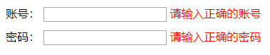
所以希望我能够改一下,改成这样:
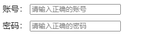
只有在进行输入且输入内容不对的时候才展示错误信息。

这位童鞋:“所以这功能能实现吗?”
我:“。。。。。。”
既然有童鞋这么看得起鱼头,还打算拿鱼头的 DEMO (opens new window) 来作内部分享,那总得硬着头皮来实现这个功能。
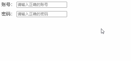
首先我们来看一下最终成果图:
DEMO 在线查看地址:https://codepen.io/krischan77/pen/WmVKYr
各位读者童鞋,来跟鱼头一起拆分下功能实现:
# HTML
首先我们来看 HTML 的源码
<form class="form" id="form" method="get" action="/api/form">
    账号:
    <input data-title="账号" placeholder="请输入正确的账号" pattern="\w{6,10}" name="account" type="text" required />
    <span class="f-tips">请输入正确的账号</span>
    <br />
    密码:
    <input data-title="密码" placeholder="请输入正确的密码" pattern="\w{6,10}" name="password" type="password" required />
    <span class="f-tips">请输入正确的密码</span>
    <br />
    <input name="button" type="submit" value="提交" />
</form>
1
2
3
4
5
6
7
8
9
10
11
2
3
4
5
6
7
8
9
10
11
这里面的 HTML 标签都比较常规,但是我们要注意下 <input /> 所携带的几个属性:
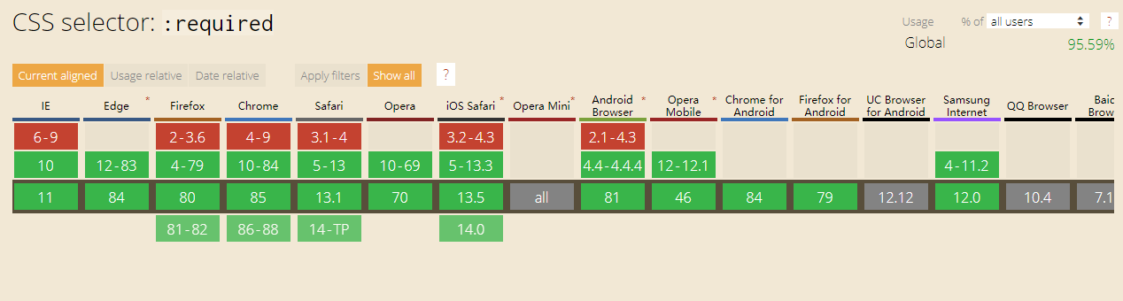
# required
<input required/> 中的 required 是一个布尔属性,用来告诉浏览器这个 <input> 是否是必填项。
我们来康康DEMO:
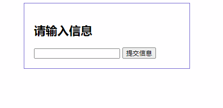
<section class="section">
    <h1>请输入信息</h1>
    <form action="/userInfo">
        <input name="text" type="text" required />
        <input name="submit" type="submit" value="提交信息">
    </form>
</section>
1
2
3
4
5
6
7
2
3
4
5
6
7
效果如下:
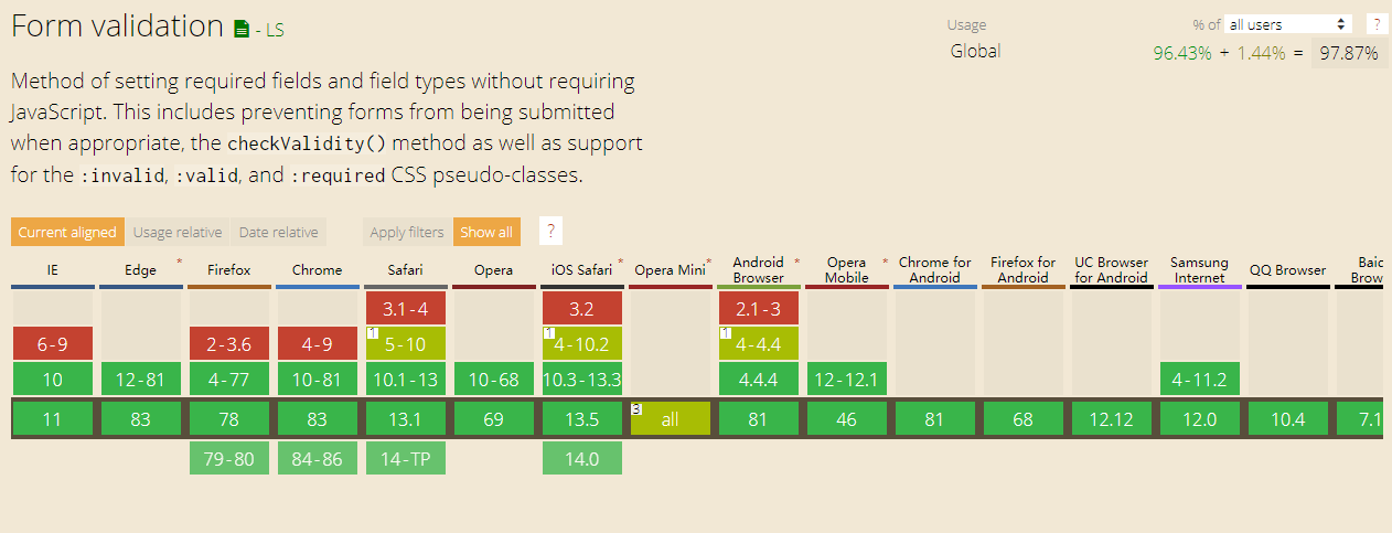
兼容性如下:
原生样式体验也是不错的。
# pattern
再来 pattern 属性。
<input pattern=""> 用于校验输入 value 是否有效。
我们康康DEMO:
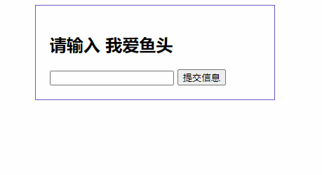
<section class="section">
    <form>
        <h1>请输入 我爱鱼头</h1>
        <input name="text" type="text" pattern="我爱鱼头"  required />
        <button type="submit">提交信息</button>
    </form>
</section>
1
2
3
4
5
6
7
2
3
4
5
6
7
效果如下:
兼容性如下:
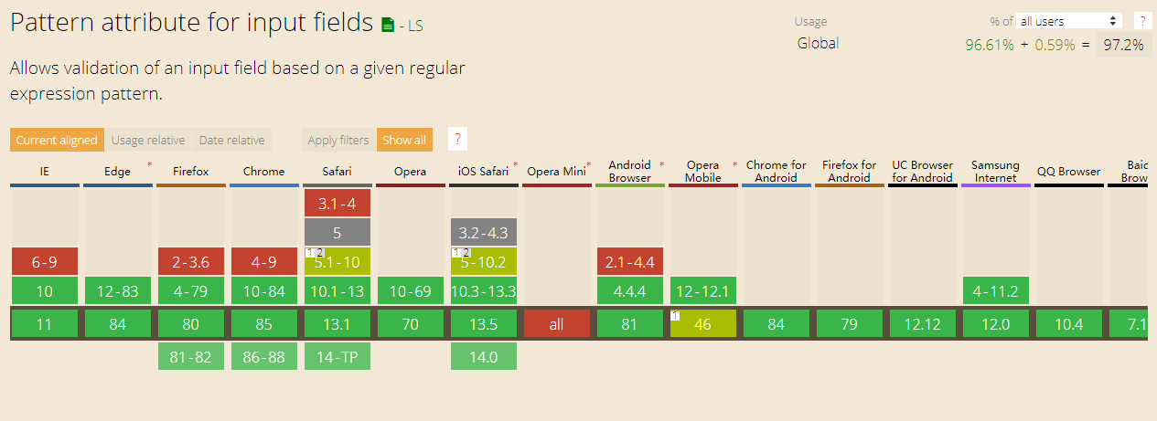
不得不感慨,原生组件的能力也是很强的。
# CSS
接下来我们康康CSS的部分,源码如下:
:root {
    --error-color: red;
}
.form > input {
    margin-bottom: 10px;
}
.form > .f-tips {
    color: var(--error-color);
    display: none;
}
input[type="text"]:invalid ~ input[type="submit"],
input[type="password"]:invalid ~ input[type="submit"] {
    display: none;
}
input[required]:focus:invalid + span {
    display: inline;
}
input[required]:empty + span {
    display: none;
}
input[required]:invalid:not(:placeholder-shown) + span {
    display: inline;
}
1
2
3
4
5
6
7
8
9
10
11
12
13
14
15
16
17
18
19
20
21
22
23
2
3
4
5
6
7
8
9
10
11
12
13
14
15
16
17
18
19
20
21
22
23
我们重点介绍以下几个 CSS 选择器:
# :invalid 与 :valid
判断有效性的伪类选择器(:valid和:invalid)匹配有效或无效,<input>或<form>元素。
:valid伪类选择器表示值通过验证的<input>,这告诉用户他们的输入是有效的。
:invalid伪类选择器表示值不通过通过验证的<input>,这告诉用户他们的输入是无效的。
例子如下:
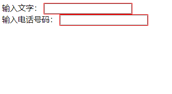
<style>
    input:valid {
        outline: 1px solid green;
    }

    input:invalid {
        outline: 1px solid red;
    }
</style>
输入文字:
<input type="text" pattern="[\w]+" required />
<br />
输入电话号码:
<input type="tel" pattern="[0-9]+" required />
1
2
3
4
5
6
7
8
9
10
11
12
13
14
2
3
4
5
6
7
8
9
10
11
12
13
14
效果如下:
兼容性如下:
# :placeholder-shown
:placeholder-shown 伪类 在 <input> 或 <textarea> 元素显示 placeholder text 时生效。
例子如下:
<style>
input {
border: 2px solid black;
padding: 3px;
}
input:placeholder-shown {
border-color: silver;
}
</style>
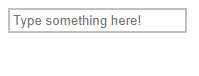
<input placeholder="Type something here!">
1
2
3
4
5
6
7
8
9
10
11
2
3
4
5
6
7
8
9
10
11
效果如下:
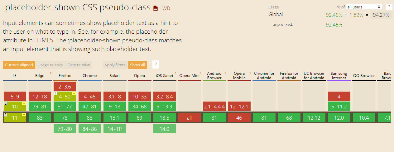
兼容性如下:
# 实现逻辑
有了上面的几个 <input /> 属性以及 css 选择器的伪类说明,那么这个纯CSS实现表单验证的功能就变得简单多了。
我们先来整理下功能要求:
- 初始化状态:不展示提交按钮以及错误提示
- 清空输入状态:不展示提交按钮以及错误提示
- 输入错误状态:输入框输入错误时,展示错误提示
- 输入正确状态:输入框输入正确时,隐藏错误提示,展示提交按钮
# 初始化状态
首先我们知道,初始化 时,是没有提示信息的,所以提示信息可以直接隐藏,至于提交按钮,我们就利用 :invalid 来隐藏,因为初始化的 input.value 内容是不匹配的。所以我们有:
<style>
    .form > .f-tips {
        color: var(--error-color);
        display: none;
    }
    input[type="text"]:invalid ~ input[type="submit"],
    input[type="password"]:invalid ~ input[type="submit"] {
        display: none;
    }
</style>
<input data-title="账号" placeholder="请输入正确的账号" pattern="\w{6,10}" name="account" type="text" required />
<input data-title="密码" placeholder="请输入正确的密码" pattern="\w{6,10}" name="password" type="password" required />
<span class="f-tips">请输入正确的密码</span>
1
2
3
4
5
6
7
8
9
10
11
12
13
2
3
4
5
6
7
8
9
10
11
12
13
# 清空输入状态
清空输入状态 也比较简单,可以直接用伪类选择器 :empty 来判断,只要内容为空,则隐藏错误信息,所以我们有:
input[required]:empty + span {
    display: none;
}
1
2
3
2
3
# 输入错误状态
在 初始化 时已经隐藏了错误信息,而 初始化 其实也是依赖于 输入错误 这个状态,不过好在我们有伪类选择器 :focus ,它表示获得焦点的元素(如表单输入),所以我们有:
input[required]:focus:invalid + span {
    display: inline;
}
1
2
3
2
3
虽然我们不能通过 输入错误 这个状态来处理,但是我们可以监听用户聚焦的行为来实现。
但是这么做有个弊端,就是当我在另外一个输入框输入信息的时候,错误提示也会消失,所以我们还需要判断是否有 placeholder,输入了 value ,自然没有 placeholder ,所以我们有:
input[required]:invalid:not(:placeholder-shown) + span {
    display: inline;
}
1
2
3
2
3
# 输入正确状态
当完成上述三个状态的实现之后, 输入正确 的状态就可以不用编写了,因为不匹配错误的,就是匹配正确。
# 总结
一个完整的 纯CSS表单功能 就这么完成了,DEMO地址在这:
https://codepen.io/krischan77/pen/WmVKYr
由于实际项目的复杂度,这个功能不一定直接用起来,但是里面的知识点,思路我们都是可以复用的。
不得不感慨,如今 html 跟 css 的能力变得强大了起来,只要我们愿意散发思维,一定能编写出更多有意思,有价值的效果。
欢迎大家多方尝试!
# 参考资料
- whatwg 4.10.5 The
inputelement (opens new window) - 纯CSS实现表单验证 (opens new window)
- 『真香警告』这33个超级好用的CSS选择器,你可能见都没见过。 (opens new window)
- CSS 选择器 (opens new window)
# 后记
如果你喜欢探讨技术,或者对本文有任何的意见或建议,非常欢迎加鱼头微信好友一起探讨,当然,鱼头也非常希望能跟你一起聊生活,聊爱好,谈天说地。
鱼头的微信号是:krisChans95
也可以扫码关注公众号,订阅更多精彩内容。